Project
001
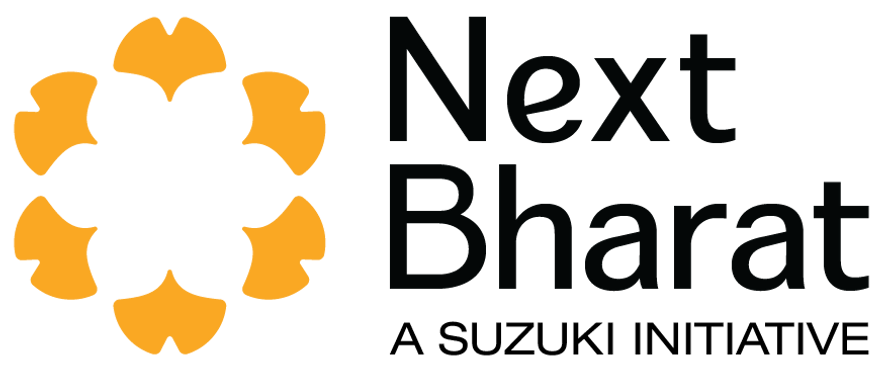
Suzuki - Next Bharat Ventures
Logo Design Competition
Winner
Next Bharat, empowers impact entrepreneurs dedicated to bridging income disparities in India by uplifting the informal and rural sectors. Their mission is to unite those driven by Cause, Contribution, and Community to create transformative change for the Next Billion in Bharat.
Info
002
Role
Logo Designer
Timeline
01 Month
Mentored by
Dr. Saurav Khuttiya Deori
Tools
Adobe Illustrator
Overview
003
Brief
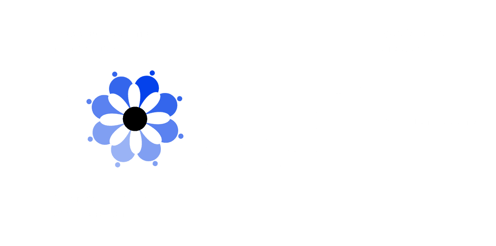
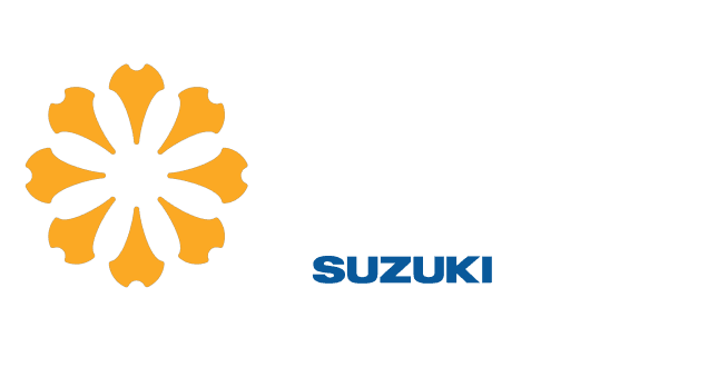
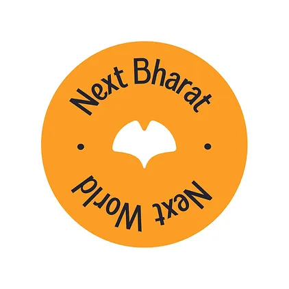
The brief was to design a minimalistic logo inspired by the Ginkgo Leaf, symbolizing resilience, growth, and innovation. Including the text "Next Bharat" and ensuring compatibility with Suzuki branding (Red/Blue or Black/White) while keeping it simple with no more than two colors, and making the text clear and legible.
Outcome
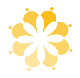
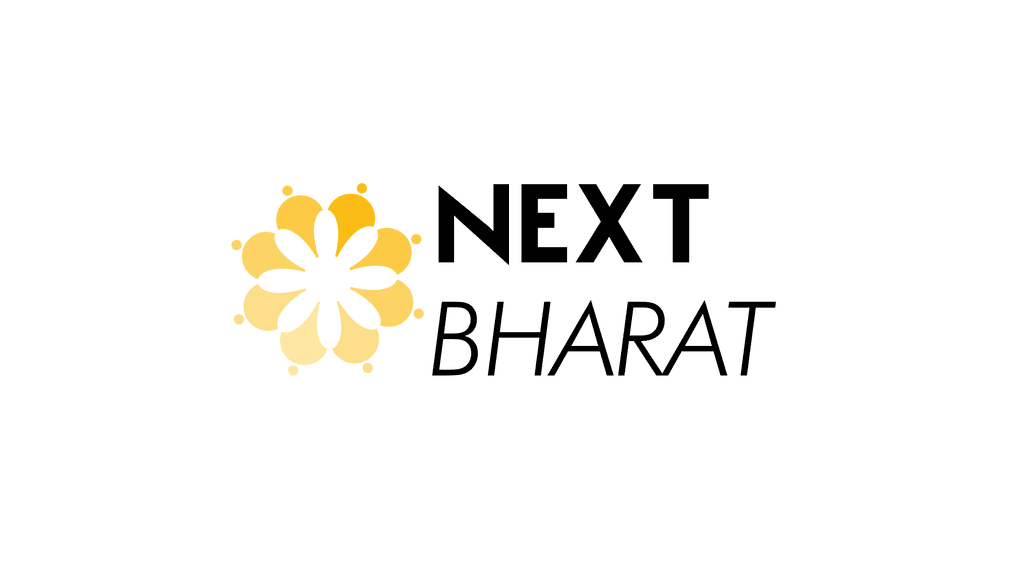
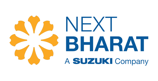
The logo draws inspiration from the Ginkgo leaf, symbolizing growth, resilience, and longevity. Abstracted arrows in a circular formation, reminiscent of Ginkgo leaves, represent innovation and expansion, while the leaves symbolize diversity and collaboration. Subtle curves resemble the Taj Mahal's dome, ensuring global recognition. The enclosed space evokes a blooming flower, aligning with the venture fund's mission. A vibrant yellow palette symbolizes growth and optimism, akin to a sunrise.
Stage 01
004
Logo Design
Iterations
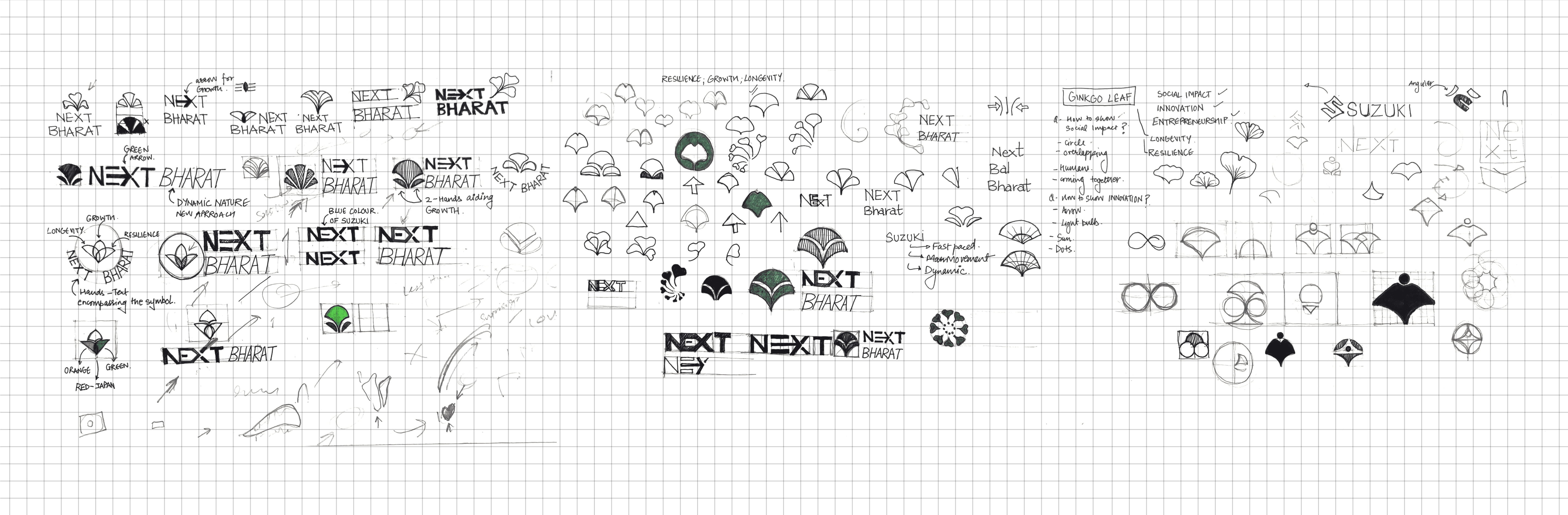
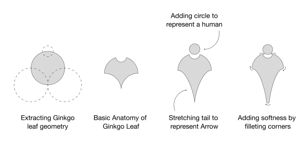
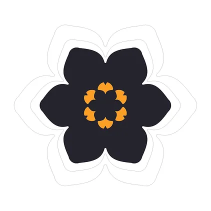
In designing the Suzuki Next Bharat venture logo, I initially experimented with abstracting the ginkgo leaf, aiming to reflect the themes of dynamism and future readiness. After several iterations, I shifted focus to the logo icon itself, recognizing that visual impact would be more effective through the design rather than typeface modifications. I transformed the ginkgo leaf into a human shape, aligning with the mission to unite individuals driven by Cause, Contribution, and Community to create transformative change for the Next Billion in Bharat.
Refining
005
Abstraction
I began reworking the ginkgo leaf abstraction to distill its essence as a symbol of community. By reshaping it into a human form, I aimed to represent unity and connection, all while preserving the distinctive character of the ginkgo leaf itself. This balance between abstraction and recognizability was key to maintaining the logo’s integrity.
01

02
03
04
End of Stage 01
006
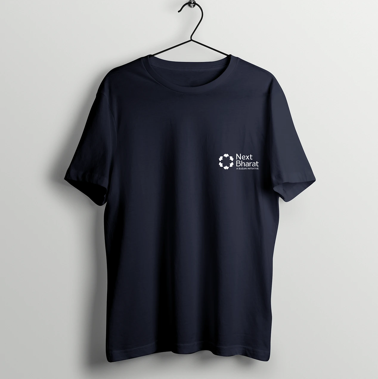
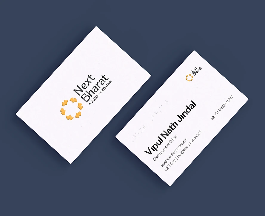
Delivery
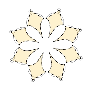
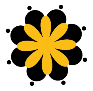
To capture the essence of community, I arranged the abstracted ginkgo leaf in a radial array, creating a visual that resembled both a flower rooted in the ground and human figures in harmony. This design approach in Stage 01 earned me a spot in the Top 20 globally.
Stage 02
007
Reflections after Stage 01
After Stage 01, I received valuable feedback that shifted my perspective on the design. Key points included adjusting the proportion of the human figures' heads, resolving a gradient issue with the yellow that could cause printing difficulties, reducing the leading between "Next" and "Bharat," and addressing the font difference, which made the typeface appear unbalanced.


Stage 02
008
Spacing & Color Iterations
I began refining the spacing between the abstracted ginkgo leaves to enhance clarity and achieve better proportions, making the logo more crisp and visually cohesive.
Stage 03
009
Reflections after Stage 02
After progressing through Stage 02, I received feedback suggesting that the ginkgo leaf was too abstract, resembling a nail, and that reducing the number of petals would enhance clarity. Additionally, I was encouraged to explore different typefaces to better complement the logo.


Refining
010
Re-Abstraction
I re-abstracted the ginkgo leaf from scratch, incorporating the feedback from previous stages. I extended the tail just enough to maintain its essence while reshaping the base into a more curvilinear form, reminiscent of the onion dome of the Taj Mahal. This gave the logo a harmonious blend of Japanese and Indian elements, symbolizing the collaboration between the two nations.
01
T-shirt
02
About
03
Journal
04
Updates
Learnings
011
Takeaways
Participating in this competition taught me the value of iterative design and the importance of adapting based on constructive feedback. I learned how subtle adjustments, such as refining proportions and balancing abstraction, can significantly enhance the clarity and impact of a logo. Additionally, the process deepened my understanding of how design can reflect cultural collaboration, requiring both creativity and precision to achieve harmony between visual elements. Ultimately, it reinforced the need for flexibility, attention to detail, and staying true to the core message of the design.