

B2B focused Fintech Startup
Internship
001
Vegapay
Product Design Intern
During my summer at Vegapay as a Product Design Intern, I got to dive into all sorts of design work—from UX audits to crafting dashboard screens, mobile app designs, and even website design. It was a great learning experience, especially in balancing different project needs and working closely with cross-functional teams. Although most of my work is under NDA, I’m excited to share the valuable lessons I picked up along the way, which really helped me grow as a designer.
Info
002
Role
Product Design Intern
Duration
Jun 2024 - Jul 2024
Tools Used
Figma
Framer
Spline 3D
Chronological Order
005
Summer &
project timeline
Although I can't share the details of what I worked on, here is the basic timeline I followed. My favourite part was building a prototype and breaking down a large project into smaller sections for testing.

Task 01
003
Design Language System UX Audit
In my first week, I conducted a UX audit of Vegapay’s Design Language System (DLS). The DLS is crucial for maintaining a consistent look and feel across all of Vegapay’s digital products. My task was to review the system against established UX laws and suggest improvements to enhance usability and consistency. This involved analyzing how design elements were applied across various interfaces and identifying areas where the user experience could be more intuitive and consistent. Here are my takeaways from the task:
01
Ensuring Visual Consistency
Recognized the importance of maintaining visual consistency across all design elements, such as typography, spacing, and iconography, to create a cohesive user experience across different platforms.
02
Optimizing for Accessibility
Learned to prioritize accessibility by ensuring adequate color contrast, especially for users with color blindness. This involved selecting color palettes that are both visually appealing and inclusive, allowing all users to interact with the interface comfortably
03
User-Centered Design Focus
Emphasized a user-centered approach by evaluating how each design decision impacts the overall usability and intuitiveness of the system, ensuring that designs are both functional and easy to navigate for all users.
04
Enhancing System Scalability
Gained insights into designing a flexible and scalable DLS that can adapt to future needs without compromising on consistency or usability, ensuring long-term effectiveness and ease of updates
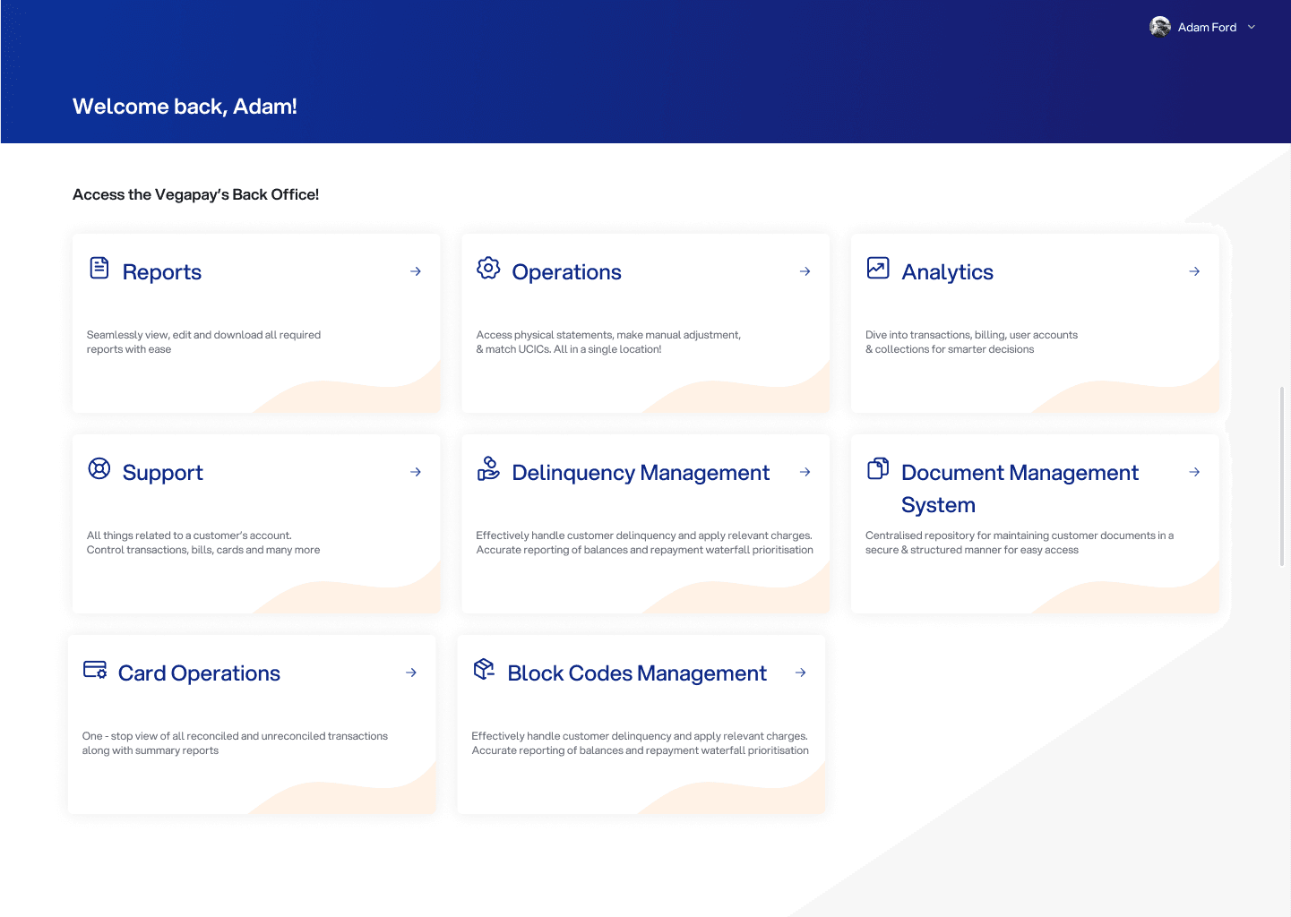
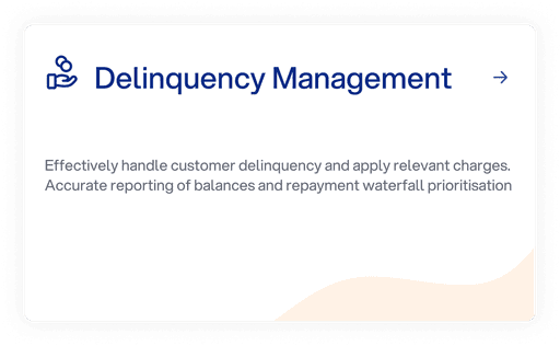
Dashboard Card Design
Providing better insight in one go
Task 02
005
Loan Management System
Dashboard Design
As part of my internship at Vegapay, I was tasked with enhancing the design of the Loan Management Backoffice dashboard, focusing specifically on improving the homepage card designs. The goal was to make the interface more intuitive and informative for bank users and employees.
01
Secondary Research Insights
During my secondary research, I discovered an insightful article discussing how a well-designed dashboard can significantly impact productivity and profitability. The article highlighted that employees could work more efficiently and make better decisions when provided with a more intuitive interface. This finding became the foundation for my redesign approach.
02
Focus on Intuition
Inspired by the research, I aimed to redesign the dashboard cards to be more user-friendly, ensuring that key information was easily accessible right from the homepage.
03
Enhanced Information Access
I concentrated on adding key pointers and summarized data directly on the cards, allowing users to quickly grasp critical details without needing to delve deeper into the system.
04
Quantified Summaries
Each card was designed to include quantified summaries, providing users with a clear, concise overview of important metrics and updates at a glance.
Old Design
New Design
Credit Line on UPI
Reimaging paying using credits
Task 03
003
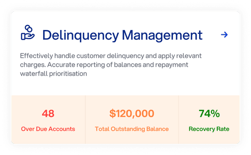
Credit Line on UPI
The Credit Line on UPI lets users access a pre-approved credit limit directly through the UPI platform, enabling seamless payments without needing immediate funds. I designed the application to simplify credit management, allowing users to easily track spending, repayments, and available credit in real time. The goal was to create a user-friendly interface that integrates smoothly with UPI, making credit access and management straightforward and efficient. Listed below are my learnings from the project:
01
Mastering Information Architecture
Through this project, I deepened my understanding of information architecture, ensuring that the flow between screens was intuitive and logical. This was crucial in guiding users through complex financial processes while maintaining clarity and ease of use.
02
Balancing Complexity and Usability
Designing for financial applications required me to balance the inherent complexity of the product with the need for a user-friendly interface. This involved simplifying interactions without sacrificing functionality, making the app accessible to a broad audience.
03
Consistency Across
Screens
Maintaining visual and functional consistency across 90+ screens was a significant challenge, but it was essential for creating a cohesive experience. Consistency in design elements such as typography, color schemes, and button styles helped reinforce the brand and improve usability.
04
Collaboration and Feedback Integration
Working on such an extensive project emphasized the importance of collaboration and integrating feedback from various stakeholders, including developers, product managers, and other designers.
Task 04
005
Vegapay Website Design
In the final month of my internship, I was tasked with redesigning Vegapay's existing website. Having gained a comprehensive understanding of Vegapay's products, I identified key features that needed to be highlighted to better engage our target audience. Following are the process and approached I followed:
01
In-Depth Product Analysis
I began by analyzing each of Vegapay’s products, identifying the core features and benefits that resonated most with users. This analysis was crucial in determining which aspects of the products should be emphasized on the website to attract and retain users.
02
Revised Information Architecture
With a clear understanding of the products, I restructured the website’s information architecture. The goal was to make the site more intuitive and user-friendly, ensuring that users could easily navigate through the content. The new architecture simplified the user journey, reducing the number of clicks needed to access key information.
03
Interactive Features for Enhanced Engagement
To make Vegapay’s website stand out in a competitive landscape, I integrated interactive elements using Spline. These features were designed to engage users more effectively, making the website not just a source of information, but an interactive experience. This approach was aimed at increasing user retention by keeping visitors engaged and encouraging them to explore more of what Vegapay has to offer.
04
Focus on User Experience
Throughout the redesign, user experience was at the forefront of every decision. I ensured that the website was not only visually appealing but also easy to navigate, with content structured in a way that aligned with how users naturally process information.
Outcome
006
Outcome
The redesigned Vegapay website now provides a streamlined, engaging, and user-friendly experience. The site effectively highlights the company’s products and services, while the interactive elements enhance user engagement. The dual-background design adds to the clarity and usability, ensuring that users—especially those from banking sectors—can easily find and interact with the information they need.
Visit Vegapay's Website